topoline.app/topo/main-topo-55
The Durness topo
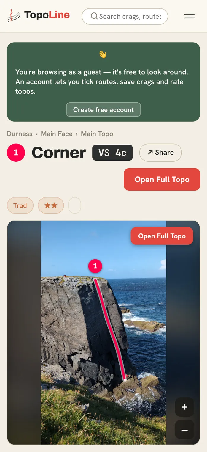
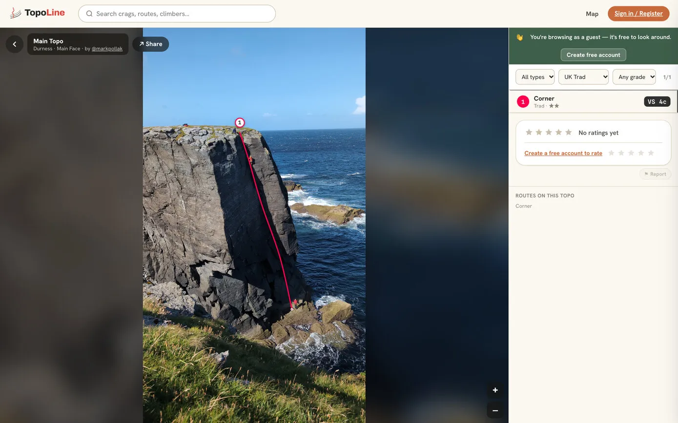
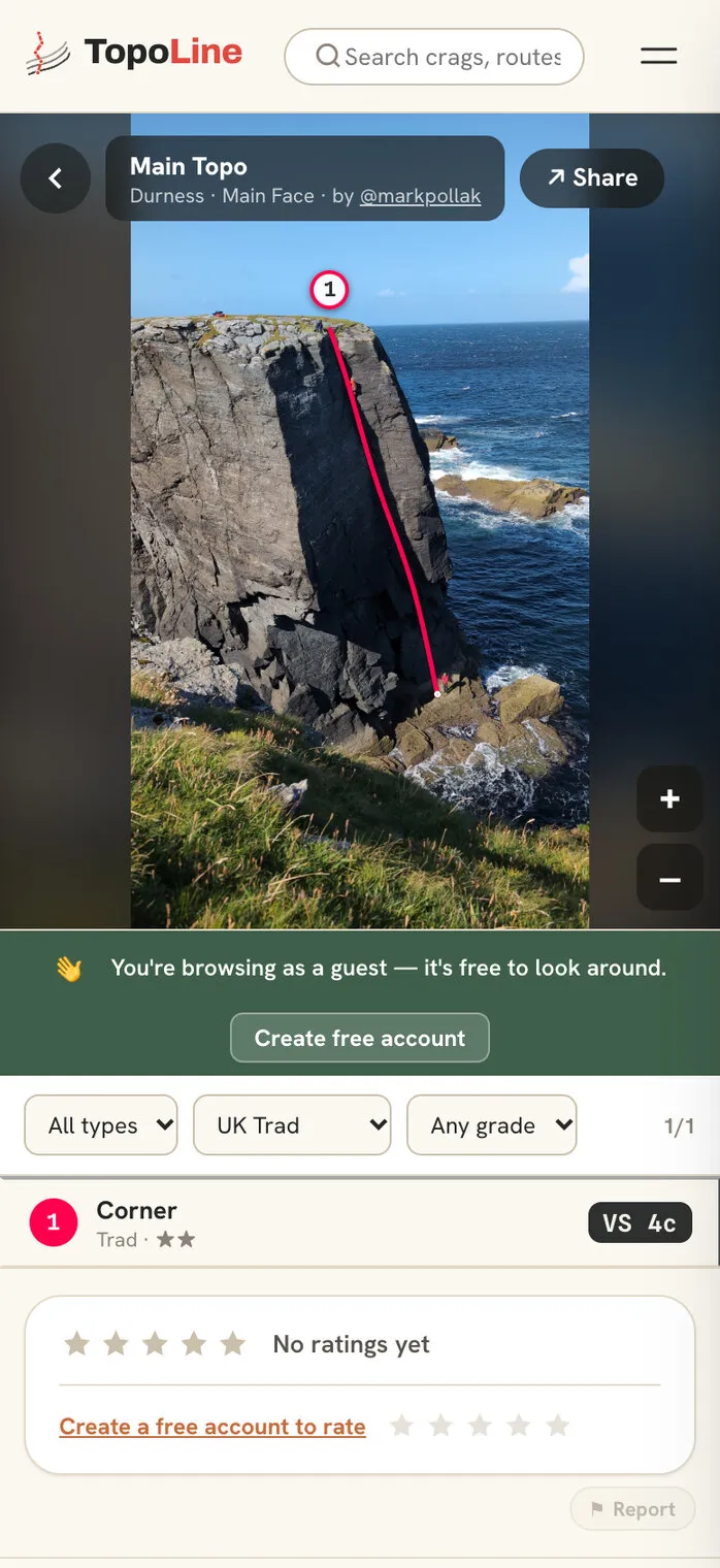
Made from a phone photo on a climbing trip to the far north of Scotland in September 2026.
- Topo
- Phone
TopoLine is an app for climbing topos: photos of the rock with every climb drawn on as a numbered line, coloured by its grade. Make your own, find your route at the crag, and use it all with no signal. It’s Mark Pollak’s own project and a work in progress: the website has been live since June 2026, and the Android app is in testing, on its way to Google Play.
I live in the Peak District, and climbing is one of the things I love doing most. Climbers find their routes with topos: a photo or drawing of the rock with each climb marked on it, its grade, its length and a description. They’re in guidebooks, on websites and in apps, and they all share one problem. The crags are where phones don’t work.
So I wanted an app that’s calm and simple, works with no signal at all, and makes it easy for anyone to draw a topo of their own crag. Not a social network or a video app: a quick way to make and use topos.
The core screen is the topo. The core action is filtering routes. The core promise is reliability at the crag.
The brief kept the app to one simple structure, crag, sector, topo, route, “no deeper”, and set the tone in one line: create your own crags, draw your route lines, filter by grade, use it at the crag. “No signal, no clutter, no faff.”
Climbers’ feedback sharpened it. Finding the climb matters as much as the climb itself, “not just the bottoms but sometimes for sea cliffs, the abseil points above”. So TopoLine grew directions from the car park, map pins for parking, abseil points and descents, and maps that work offline.
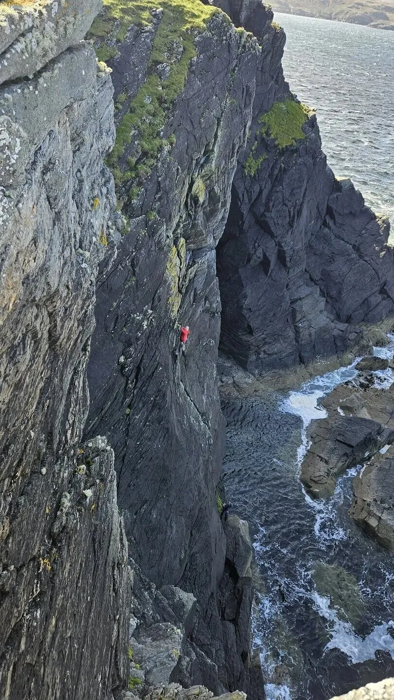
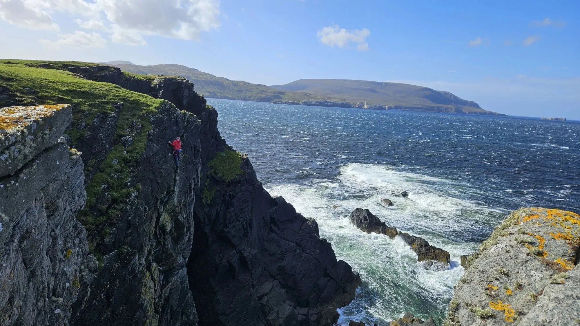
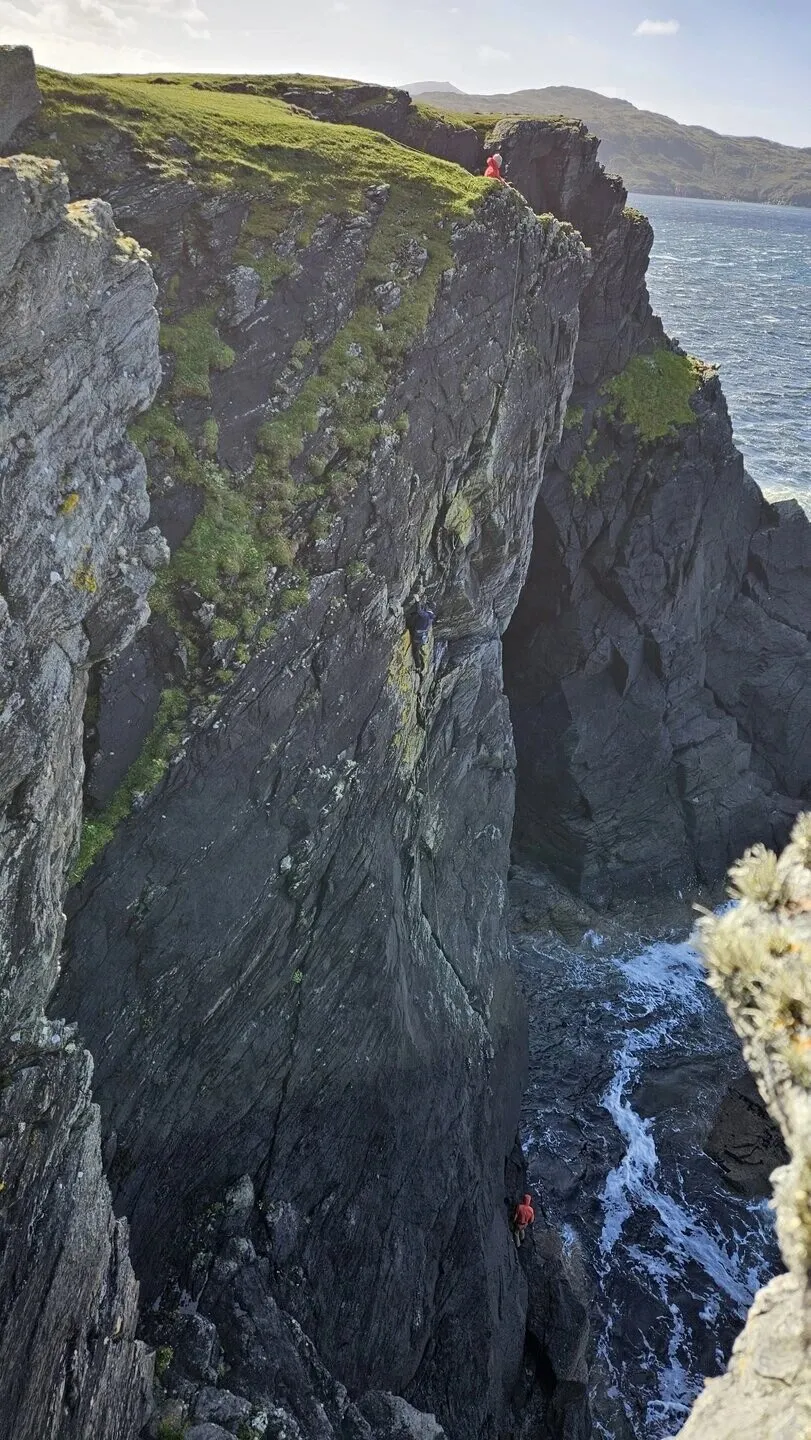
Mark’s first new route came in September 2026, at Faraid Head, a headland of dunes and sea cliffs near Durness on the north coast of Sutherland, climbed with the mountaineer Mick Fowler and George Bell. It’s called I’m Lemon Barnaby, and it’s in the UKClimbing logbook and the Scottish Mountaineering Club’s database of Scottish climbs.
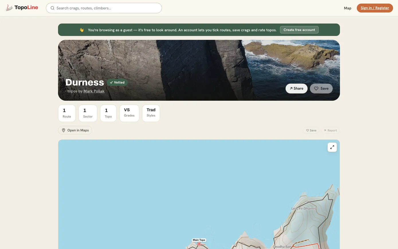
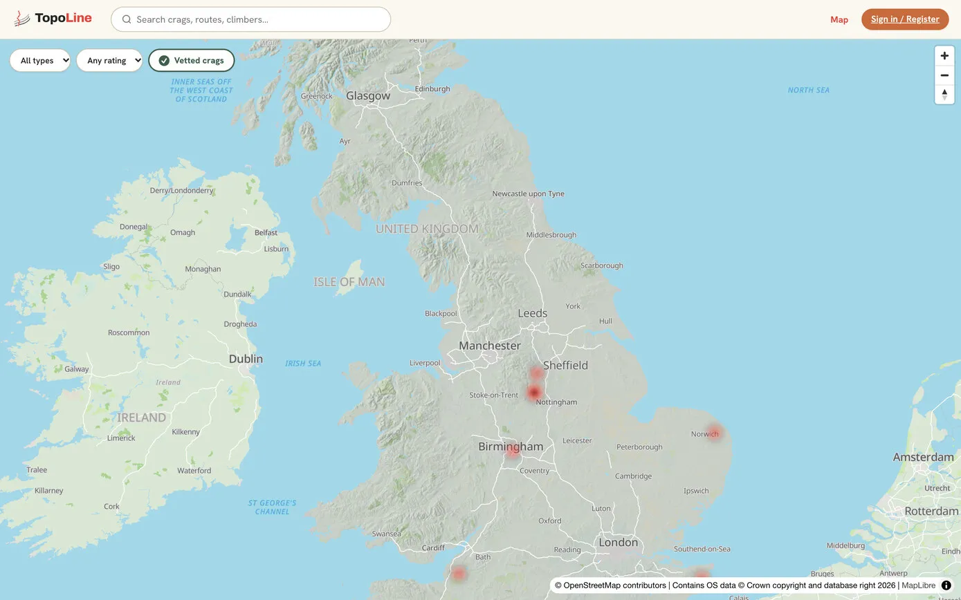
On the same trip Mark made a Durness crag in TopoLine from a phone photo of the cliffs: the app doing exactly what it was built for.
AI wrote the code, but the experience was designed. The look started from a detailed design hand-off: colours named after the rock (chalk, limestone, slate, moss, rust and a Route Red), three typefaces, and screen-by-screen specifications. Mark is working on the design in Figma too, still a work in progress, and the logo is Mark’s own: a faceted grey boulder with a red route line up it.
Then came the details only a climber would ask for. A few of Mark’s requests, and what they became:
Select a route by tapping or clicking on the line of the route itself, not just the number at the top. … Zoomed in, you won’t see the top number.
Every line is something you can tap, at any zoom, and the list scrolls to match.
It needs to zoom like Google Maps when you click the plus. … It zooms into the centre of what you’re looking at. … No black screen.
The buttons zoom on the centre of the screen, up to eight times, and you can’t pan off the edge of the photo.
Not enough screen given to the image: it really needs to cover about 70% of the height. … It would be nice if this edit screen mirrored the topo screen.
The phone editor became the topo viewer with extra buttons.
Let’s plan this first using wireframes, before building. … I’d rather have the line between the route information and the photo above draggable, whilst keeping the same zoom level, … a short light grey line indicating it is draggable, like Facebook does.
Four wireframes, agreed before any code. Then a draggable divider that keeps the zoom, made silky smooth when the first version felt a little jagged.
User feedback says that we need more detailed maps, including footpaths.
Bold footpaths, cliffs, woods and fields on every map, and contours and hill shading for the whole of Great Britain.
Mark’s messages from the build, with typing slips tidied.
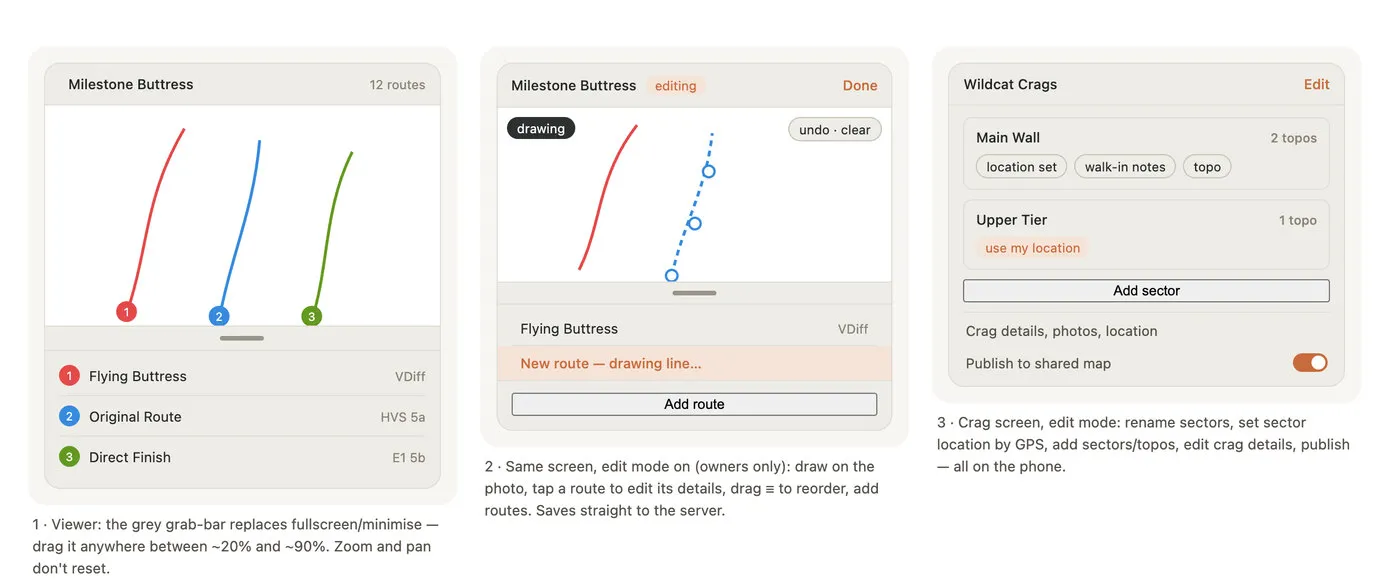
Three of the four wireframes agreed before the phone editor was built, July 2026. The fourth is the upload queue.
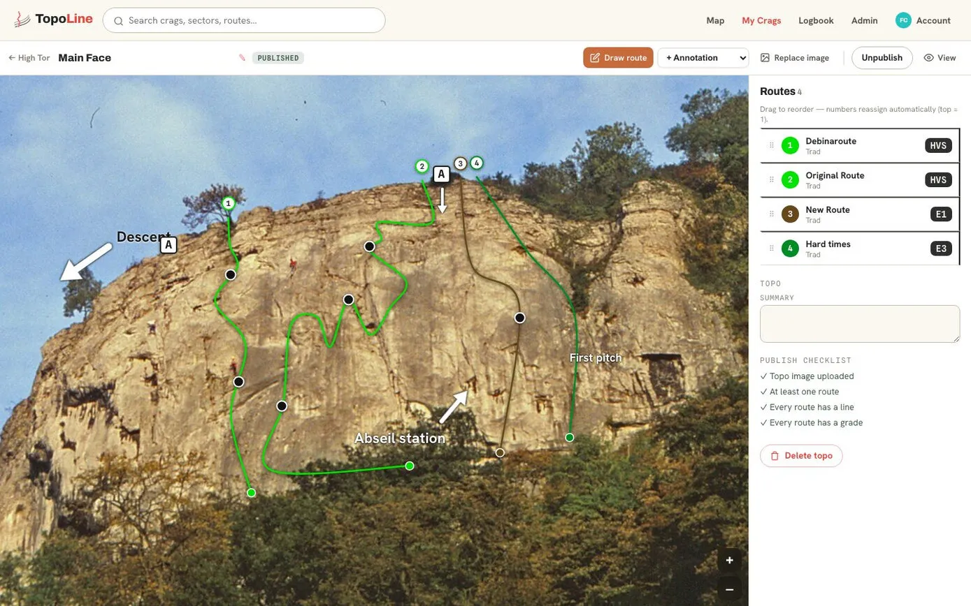
Everything else in the app serves this screen. The photo fills it, with each route drawn on as a numbered line in its grade colour. The colours are automatic and can’t be changed, because a colour picker would make a rainbow that means nothing:
Pinch to zoom up to eight times: the numbers and markers stay the same size, so they never cover the rock. Filter by type of climb and “up to grade” in seven grading systems. Tap a route and its details open under it in the list: the description, a photo of where it starts (“am I on the right line?”), and buttons to tick it or mark it as a project. Topos can also carry abseil stations, notes, arrows and belay stances.
How a line is drawn. Each route is a handful of points, saved as fractions of the photo’s width and height, with a smooth curve drawn through them.
The lines are never burned into the photo. Each one is a list of points, saved as fractions of the photo’s width and height, and drawn over it as a smooth curve (a Catmull-Rom spline, turned into Bézier curves). So lines stay sharp at any zoom, wide panoramas work, and a photo can be replaced, or a line nudged, years later.
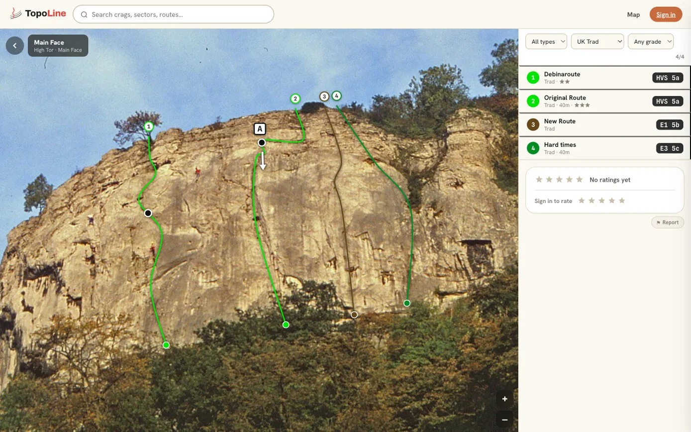
On a computer, My Crags is a studio for making topos. Press the orange Draw route button, click up the line from the ground, double-click to finish, then drag the white handles to shape it. A small “+” sits on the curve between handles: drag it to add a bend. Drag the routes into order from left to right and the numbers follow; set the grade and the colour follows.
Before anything is published, a checklist makes sure the photo is uploaded, every route has a line and a grade, and the topo has a location. The person publishing confirms the photo is theirs to share.
Mark was clear from early on that the phone matters most:
A lot of people will not use or even own a computer, so the phone has to be the way that all crags can be edited.
So a whole crag can be made on a phone, at the crag, with no signal: details, location (“use my current location” works offline), photos from the camera at full quality, sectors, topos and lines, tapped on with a finger. Back in signal, it uploads itself: the words first, then the photos one at a time, with a progress bar. If the signal drops, it carries on where it stopped and never makes a copy twice, and there’s always a Stop, Retry or Delete button, never an endless spinner.
One tap on Save downloads a whole crag to the phone. After that it opens straight from the phone, instantly, and quietly checks for changes when there’s a signal. The brief was firm about it: a saved crag must open with no signal, without asking for a login or checking a subscription.
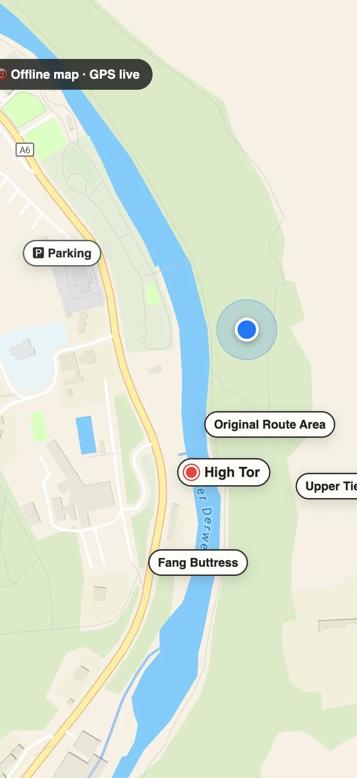
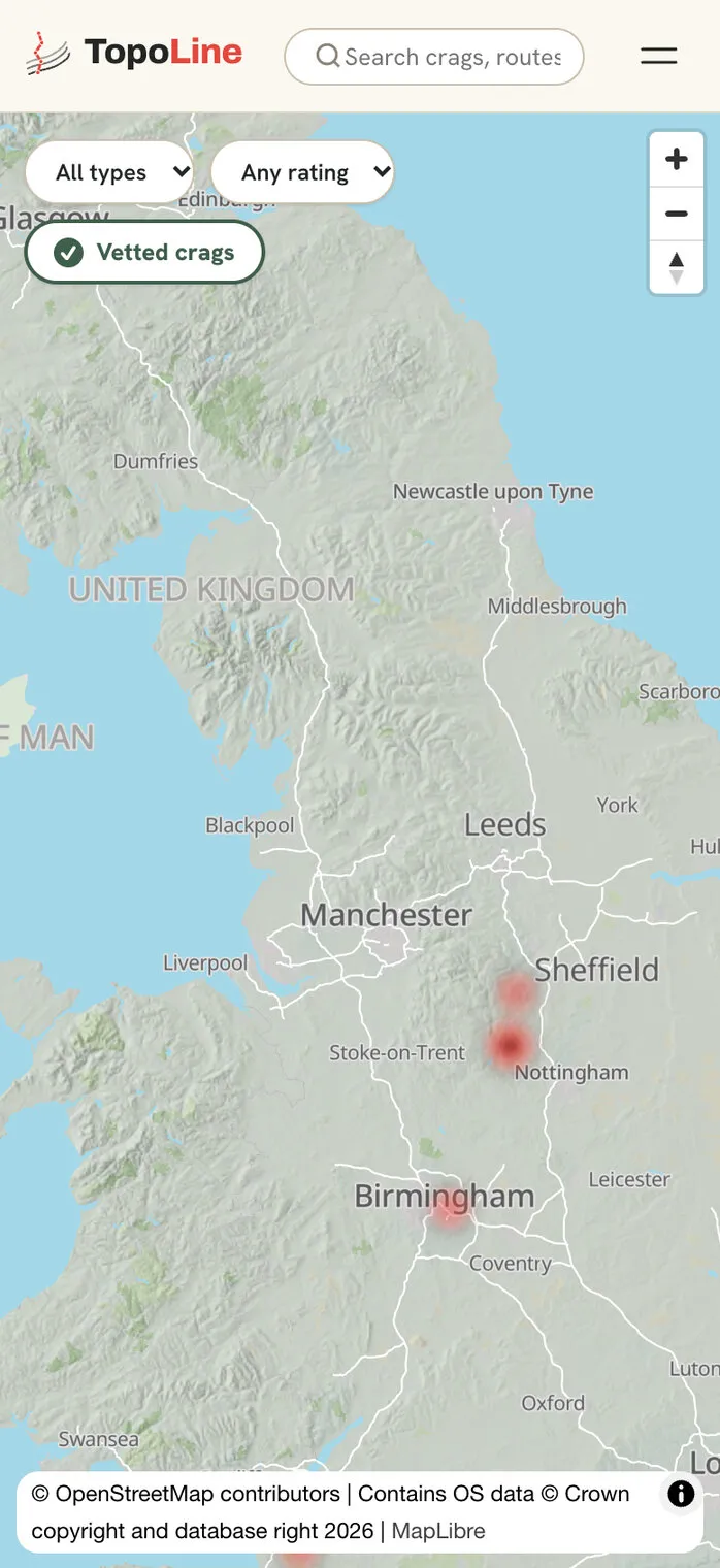
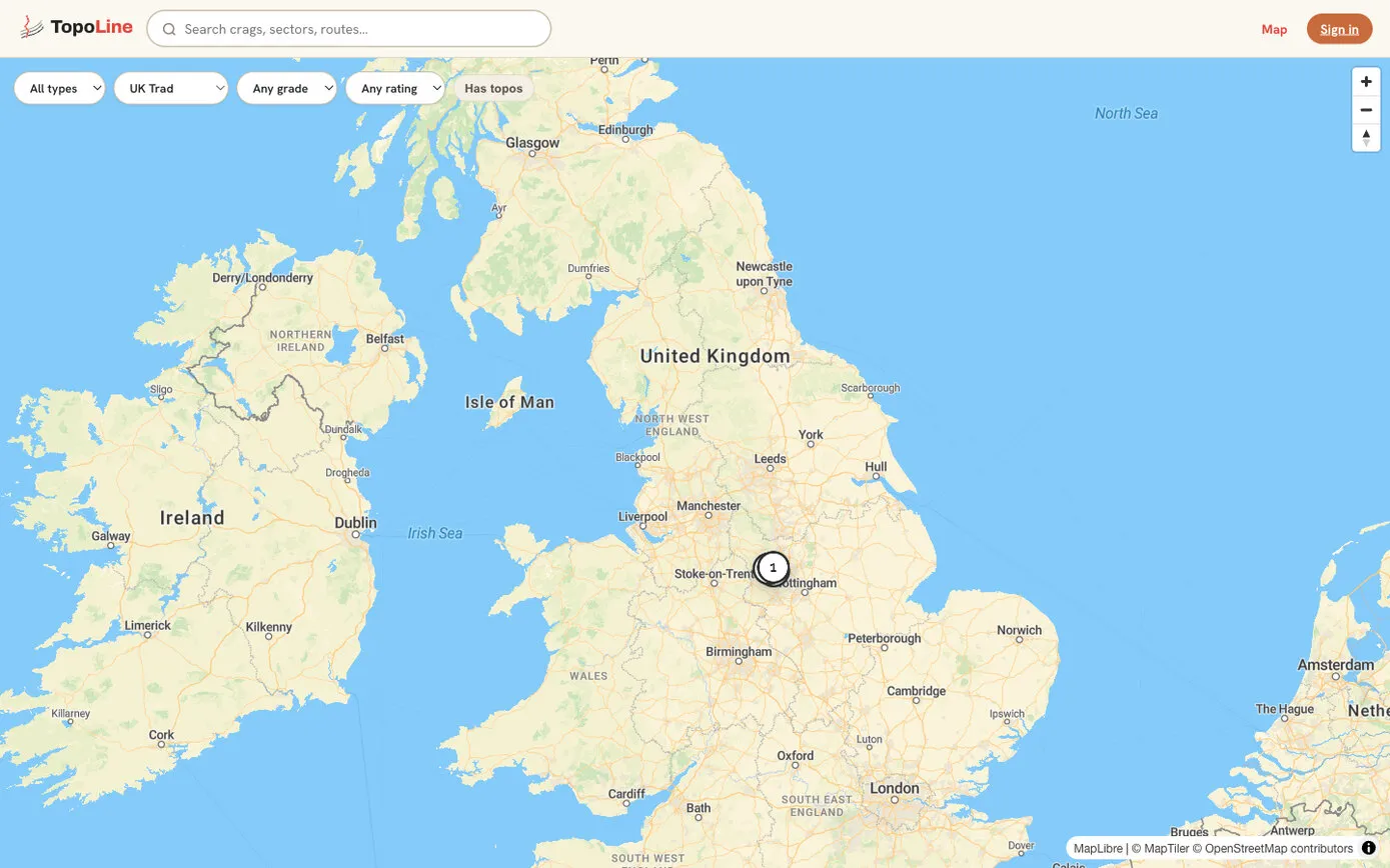
Maps were the biggest journey. Google Maps was priced up and ruled out on cost on day one. The first maps came from hosted services; by July, TopoLine was drawing its own, from OpenStreetMap data for the whole planet, about 65 GB of it on a disk of its own, with no charge per map tile and no keys to manage.
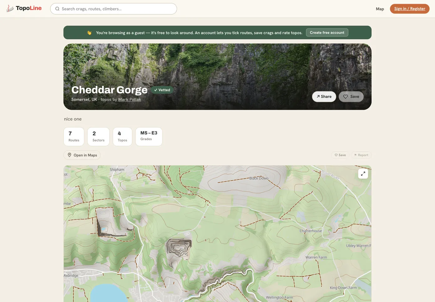
After feedback from climbers, the maps were restyled the way walkers’ maps are: bold footpaths and bridleways, cliffs as strong dark lines, woods, fields and scree, peaks, parking and campsites. For Great Britain there are 10-metre contours and hill shading, made from Ordnance Survey’s free height data. The same style is used on the website and in the app, so a crag looks the same on both.
Creating is free and unlimited for everyone, and so is browsing the website, because the topos are what makes the app worth having. What Pro pays for is having every crag offline on your phone. People who make crags keep them free on the app for life. In Mark’s words: “this is to reward owners and uploaders.”
Payments are built two ways: Stripe on the website, and Google Play and App Store billing in the app, through RevenueCat. Both write to the same account, and whichever subscription runs longest wins. Both are still in test mode.
I want to use Apple App Store and Google Play’s inbuilt billing system to collect payments … and also so I can put upgrade links in the app.
| Plan | What you get |
|---|---|
| No account | Read everything on the website, with a gentle prompt to make a free account |
| Free | Unlimited creating and browsing. On the phone: your own crags for life, the featured crag of the week, and three crags of your choice |
| Trial | Seven days of Pro, starting when you confirm your email address. No card needed |
| Pro | Every crag offline, the whole map in your pocket, and 28 days between check-ins |
TopoLine is three things that share one server: the public website, the My Crags studio, and the Android app. The app’s JavaScript updates over the air, so most fixes reach the phone without a new build.
For location, the app uses the phone’s GPS for the dot and the way you’re facing, and the website the browser’s own location. Parking and access points can also carry a what3words address. Offline, the app keeps its own small database and folders on the phone for the saved crags, photos, map tiles and anything made at the crag, waiting to upload.
| Part | Built with |
|---|---|
| Website and My Crags | React 18 and TypeScript, built with Vite; maps with MapLibre GL JS; hand-written CSS, no framework |
| Android app | Expo SDK 54 and React Native 0.81; MapLibre for maps; Expo Location for GPS; SQLite and the file system for offline; React Native SVG, Gesture Handler and Reanimated for drawing and zooming |
| Server | Python 3.11 with FastAPI, SQLite, secure sign-in tokens, and Pillow for photos up to 24 megapixels |
| Maps | OpenStreetMap data from Protomaps, served from its own map files; contours and hill shading made from Ordnance Survey Terrain 50 with GDAL and tippecanoe |
| Hosting | A DigitalOcean server running Docker behind a Cloudflare Tunnel; photos in Amazon S3 in London, backed up nightly to Cloudflare R2 |
| App builds and updates | Expo’s EAS Build and EAS Update |
| SendGrid, for confirmations, trial reminders and password resets | |
| Payments | Stripe on the web; RevenueCat for Google Play and the App Store |
| Places | what3words, and OpenStreetMap’s Nominatim to fill in the country from a map pin |
Mark set the direction and tested every build on a phone. Claude wrote the code, the documents and the tests and put each change live, over about 30 Claude Code sessions, most of it between 6 June and 7 July 2026. 219 of the 243 saved changes carry Claude’s name. The result is about 32,000 lines: 10,000 for the website, 12,800 for the app, 7,100 for the server and 2,000 of tests.
The rule was that a different session checks the work, often on a different model. Its findings came back, the fixes went in the same day, and each one was written into the project’s notes, so the next session started with everything that had been learned.
Code and product review · 6 August 2026
The 6 August review’s scorecard. Its summary: “TopoLine is in genuinely good shape — unusually so for a solo-built product.” The D is what’s left to do before Google Play.
| Claude model | Saved changes | Mostly used for |
|---|---|---|
| Claude Fable 5 | 123 | The rebuild as TopoLine, the June and July features, the reviews |
| Claude Opus 4.8 | 66 | Phone editing, payments in the app, deep links |
| Claude Sonnet 5 | 17 | The global map and the first social features |
| Claude Sonnet 4.6 | 13 | The first day, as a prototype called Atopo |
The website is live and the Android app runs on Mark’s phone, updating itself over the air. Before it can go on Google Play, there’s a list of jobs the stores rightly insist on:
| Job | Status |
|---|---|
| Website, map and My Crags studio live | Done |
| Android app in testing, with over-the-air updates | Done |
| Make and edit whole crags on the phone, offline | Done |
| Offline maps for every crag | Done |
| Payments on the web and in the app (built, in test mode) | In progress |
| Privacy policy and a support contact | To do |
| Delete your account, in the app and on the website | To do |
| Terms and policies checked by a solicitor | To do |
| Real crags on the map in place of test ones | To do |
| A closed test with a group of climbers | To do |
| The Google Play listing | To do |
TopoLine is a work in progress, and that’s the fun of it. Every review came back to the same point: the hard part isn’t features, it’s topos. An app like this is only as good as the crags in it, so the next stage is real crags, drawn by real climbers, starting with boulderers and then route climbers.
On the list after launch: comments and shared ascents, photo galleries for routes, offline mode on the website, and an iPhone app.
A personal project, built in the evenings and at weekends. If you have an idea for an app, we’d like to hear about it.