diamondcourtdental.co.uk
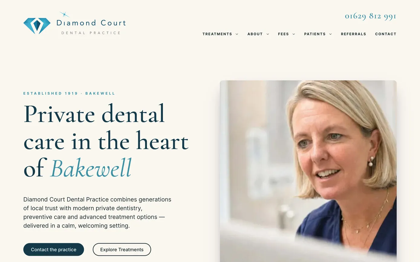
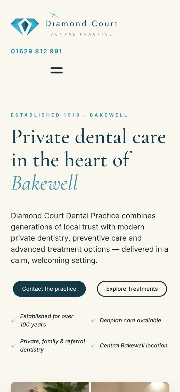
The home page
Calm, editorial and quick: live since 16 October 2026.
- Website
- Speed
Diamond Court is a dental practice in Bakewell, in the Peak District: there’s been a dental practice on its site on Water Street since 1919. We first met the practice in September 2007, six weeks before the first iPhone went on sale in Britain, and we’ve built all three of its websites since. The newest went live in October 2026. It scores 98 for performance in Google’s PageSpeed test on a phone and 100 on a computer, with our own Google reviews system and enquiry tracking built in, and secure online forms for referring dentists and patients. For it we spent a day photographing the practice and its team, and we look after the site’s hosting and care.

The website it replaced was built in 2013, when many sites fitted their menu onto a phone as a drop-down box. Tap “Select Page” on the old site and the phone listed all 29 page names at once, some of them twice.

The new site starts from the phone. The menu button opens a full-screen menu with exactly the links a computer shows, in the same order: Treatments, About, Fees and Patients each open their own list, and Referrals and Contact are a tap away. On a computer, the treatments open as a panel grouped by need, from implants to orthodontics.
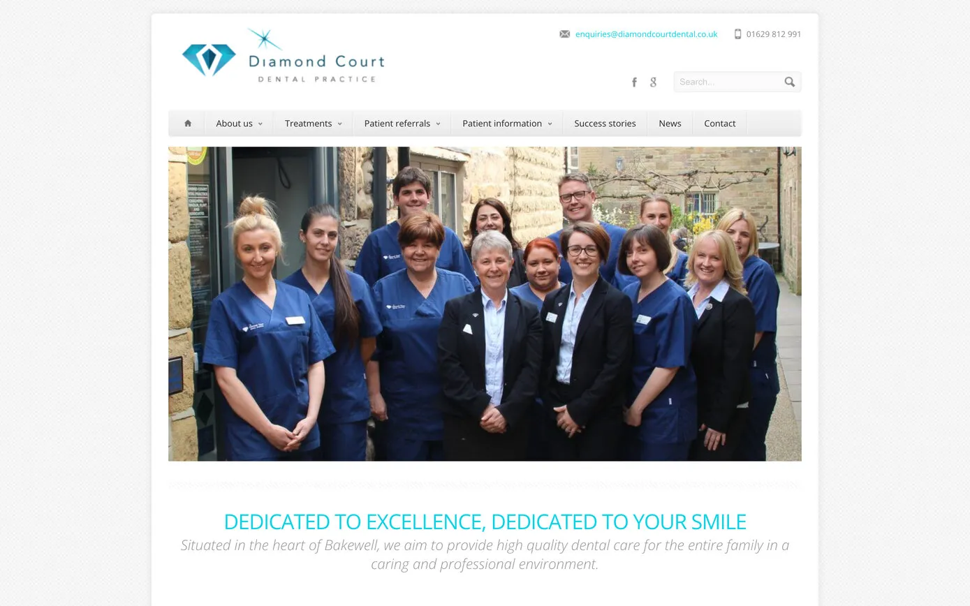
Drag the divider: the 2013 home page on the left, the 2026 one on the right.
2013 site
2026 site
Opening the menu on a phone. The 2013 site’s list is drawn as an Android phone shows a drop-down box; the 2026 site is the real thing.
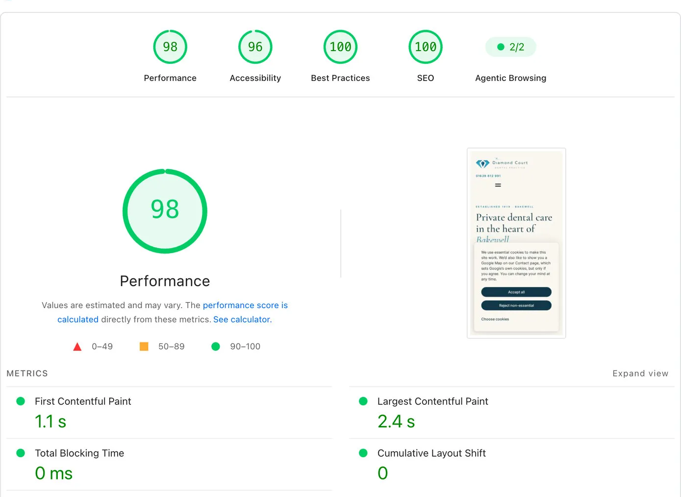
Google’s PageSpeed test measures how quickly a page appears and how well it’s built. On a phone, the Diamond Court home page scores 98 for performance: the first words appear in 1.1 seconds and the main picture in 2.4, and nothing jumps about as it loads. On a computer it scores 100, with the first words in 0.3 seconds and the main picture in 0.5. Best practices and SEO score 100 on both, and accessibility 96.
Google PageSpeed · on a phone
On a computer
How quickly the home page appears
Google PageSpeed Insights, home page, 16 October 2026, 6:36pm, the evening the site went live. The timings are Google’s lab test; scores vary a little from one test to the next.
The site is a lean, modern WordPress build, made for speed from the first line. What makes it quick:
Why it matters: most people look for a dentist on their phone. Google uses page speed in its rankings, and a slow page loses people before it has even appeared.
The practice’s Google reviews come through our own reviews system, which keeps them in the website’s own database and refreshes them from Google every day. Because they’re the site’s own content, there’s no ready-made widget to put up with: we design them like any other part of the page, and nothing loads from another company.
On the home page they drift past in two rows, one each way, across the full width of the screen. They pause under the pointer, and a button stops them for anyone who’d rather they kept still. On New patients and Treatments they’re a carousel of cards; on About, Contact and every treatment page, one at a time in a spotlight; and the Google reviews page is a wall of them. The cards link to the originals on Google.
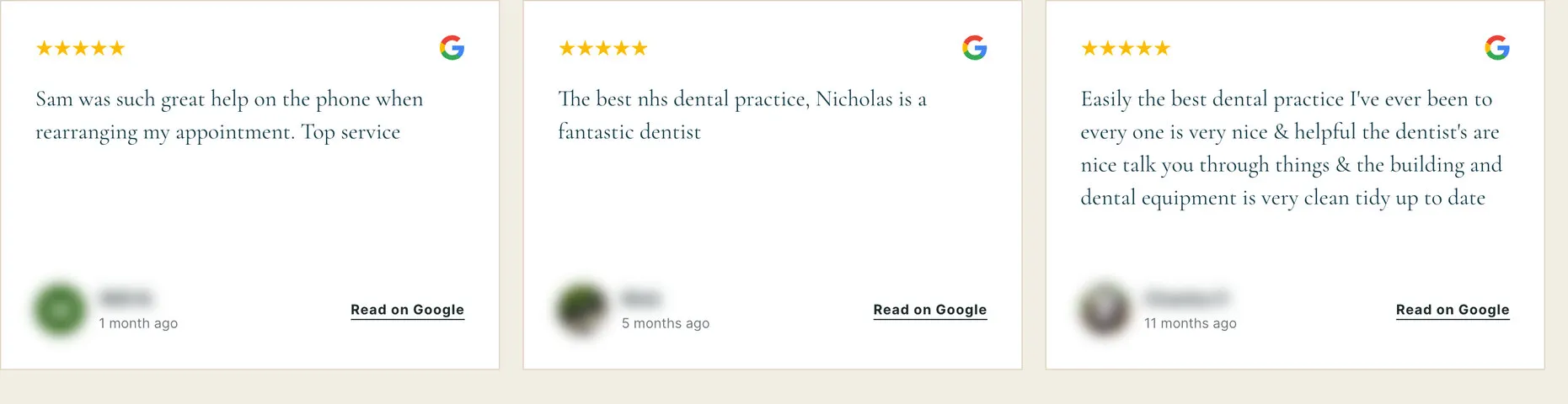
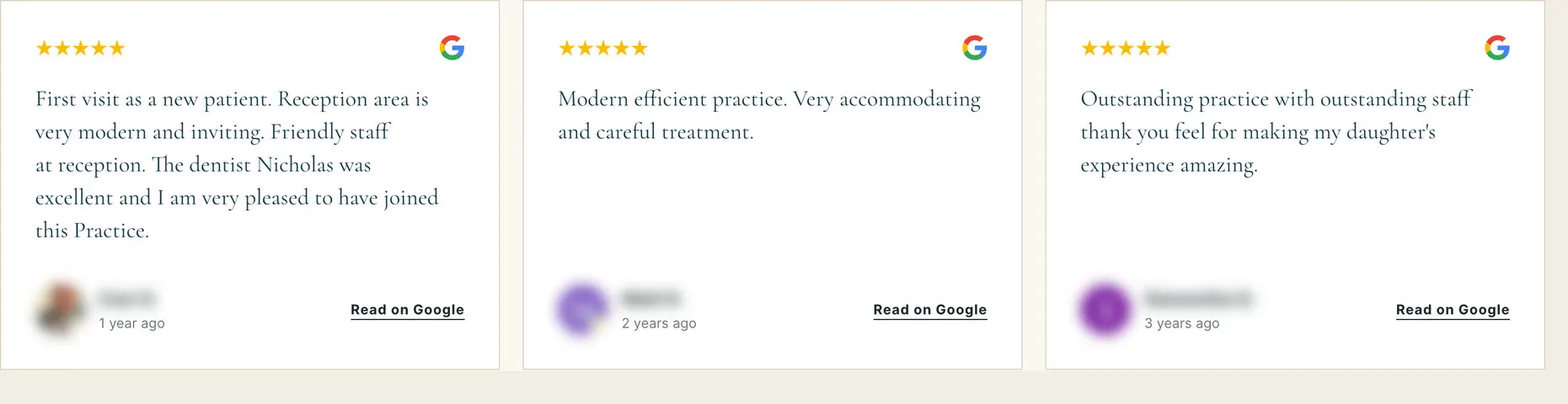
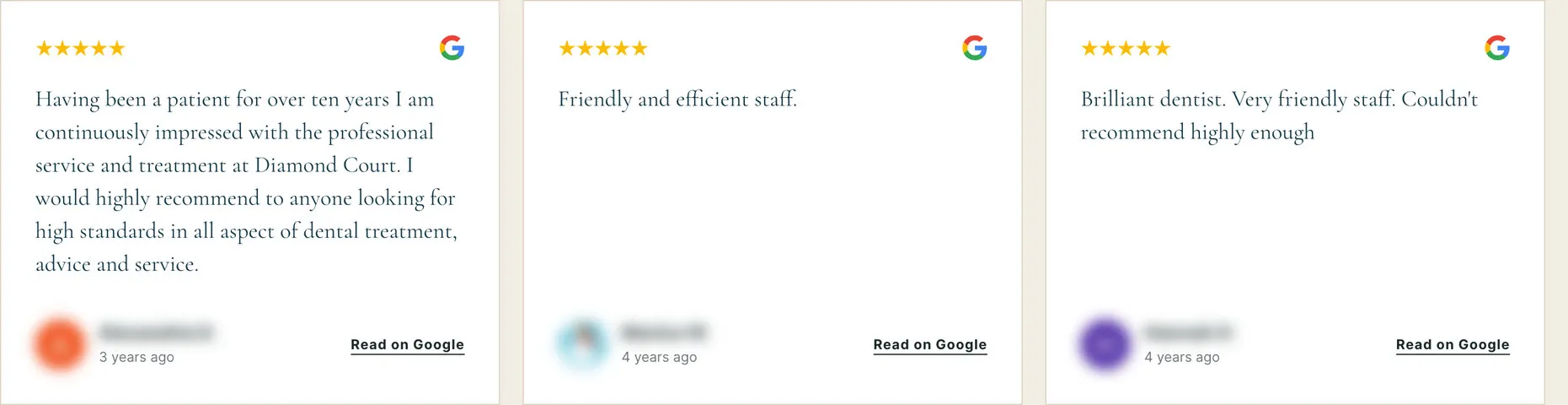
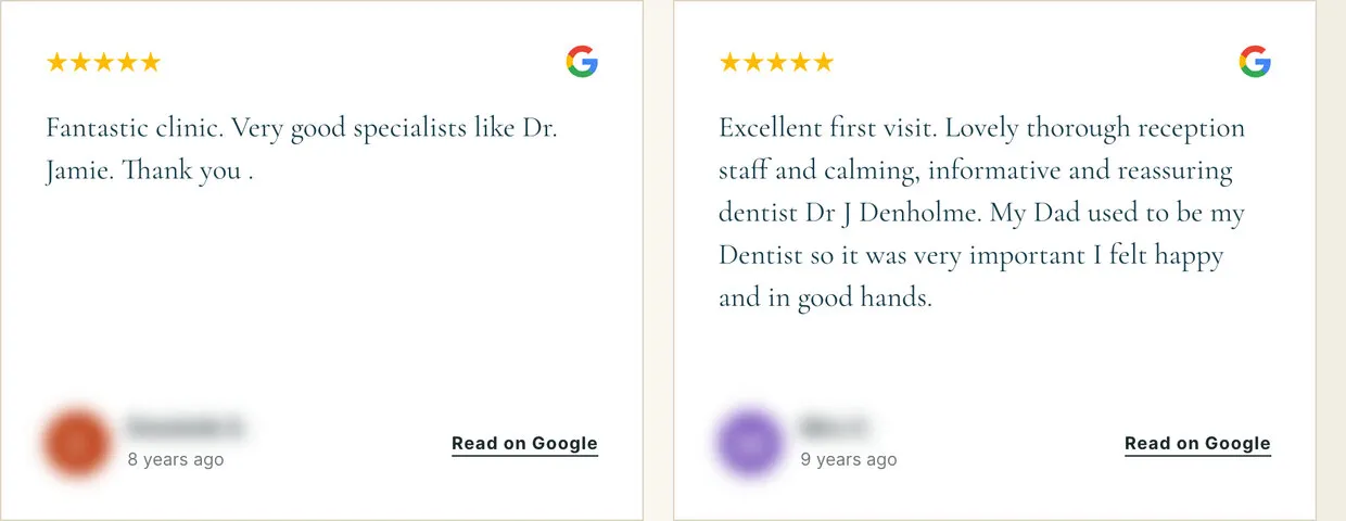
The home page’s reviews, moving as they do on the site. Reviewers’ names and pictures are blurred here.
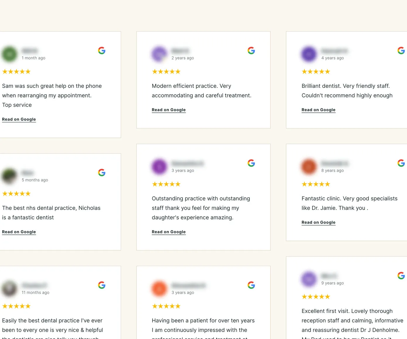
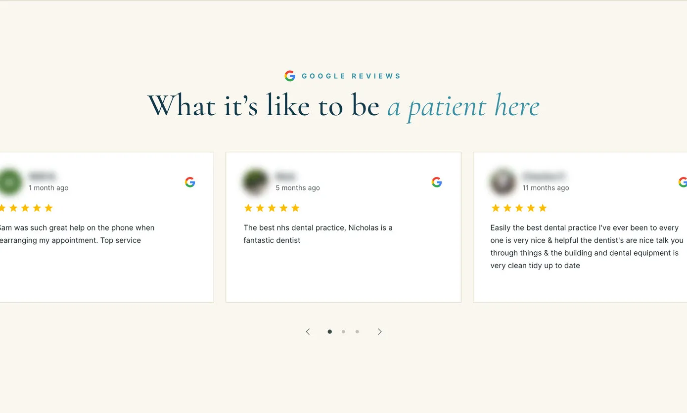
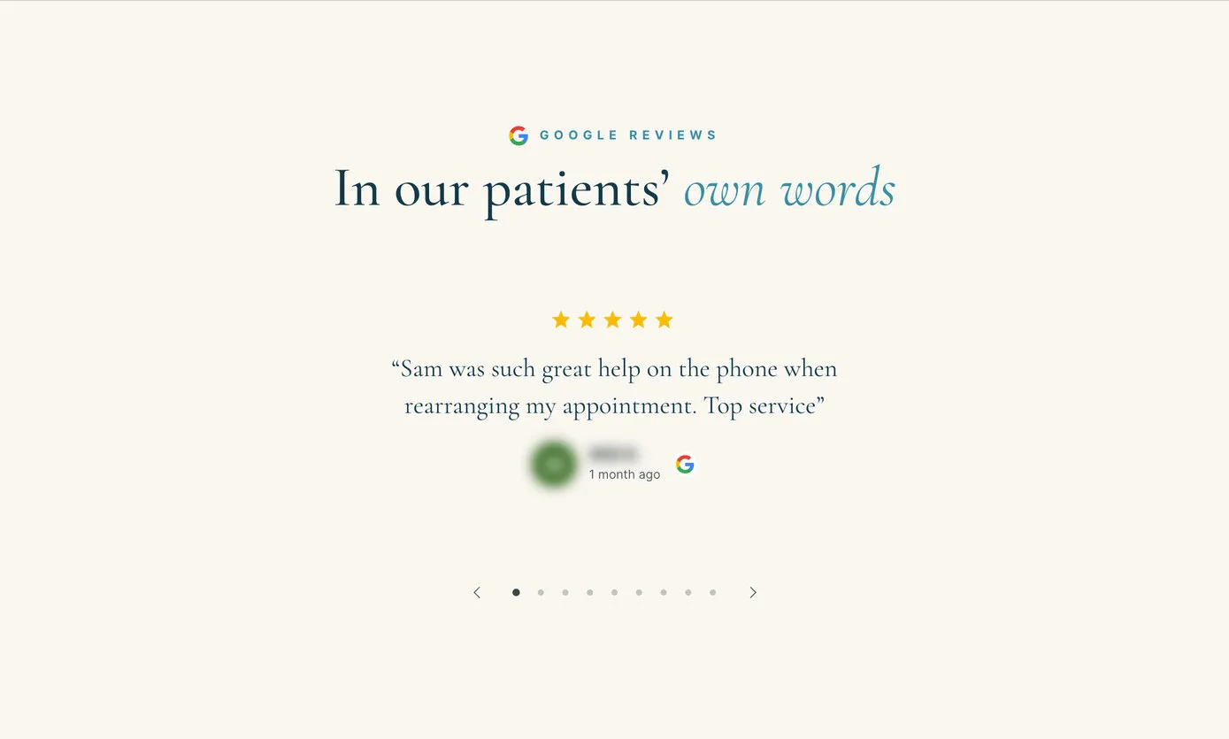
Three more of the designs, from one set of reviews.
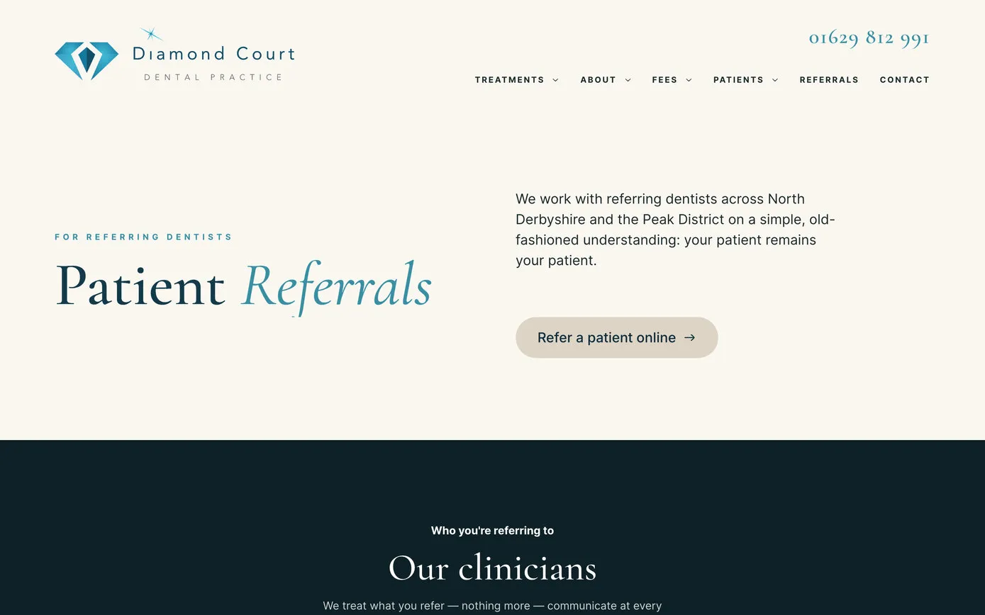
Other dentists across North Derbyshire refer patients to Diamond Court. In 2013 Paul Flint, now co-principal, asked us for a way for them to do it online, and it had to be secure. So the referral form isn’t a website form at all.
It runs on a secure, encrypted form service. A referring dentist fills it in on the Patient Referrals page, attaches X-rays if they have them, and gets an automatic thank-you. The practice gets an email to say a referral has arrived, then signs in to its secure account to read it. None of it is stored on the website.
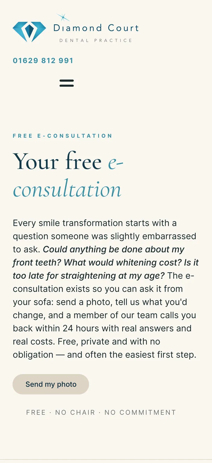
The free e-consultation, the practice’s own idea, works the same way. A patient sends a photo of their smile and says what they’d like to change, a dentist looks at it, and the team rings back within 24 hours with the options and costs. The photo goes to the same secure account, never into the website. Both have run since 2013, and both came straight across to the new site.
Our own enquiry source tracker is built in too. Once a visitor allows analytics cookies, it notes how they found the site, whether a Google search, Google Maps, an advert or a link from another website, and the pages they looked at. When they send an enquiry through the contact form, the practice’s copy arrives with a “Where this enquiry came from” report at the foot.
So the practice can see which of its marketing brings in enquiries, one enquiry at a time, without logging in to anything. Alongside it, privacy-friendly visitor figures need no cookies at all, and the site’s earlier Google Analytics history came across, so the trends carry on.
Every visitor’s choice is respected. Our own cookie banner gives separate choices for analytics and for the map on the Contact page, and the tracker and the map both wait until a visitor agrees.
Where this enquiry came from · an example
How the report reads at the foot of an enquiry. The details here are an example, not a real enquiry.
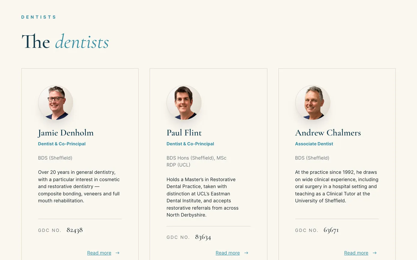
We wanted the site to feel like the practice: unhurried, transparent and quietly excellent. So it reads more like a magazine than a typical dental website, in warm ivory and stone with the deep teal of the practice’s logo, headings in the elegant serif Cormorant Garamond against the clean, modern Inter, and a fine line-drawn diamond, used sparingly. Costs are written out and credentials set down plainly, with every clinician’s GDC number on their profile.
We sent three sample pages in July, the home page, About and Dental Implants, and the reply came back from Pamela Drabble, the practice’s clinical manager:
Everything so far looks great… love the vocabulary used to describe the practice. The colour scheme is lovely.
In April we spent a day at the practice with our camera: the rooms in the morning, then portraits of the team at lunchtime. Anyone who missed the day was photographed later, and every portrait was edited to match, so the team page looks as if everyone came in on the same day.
Then the words. We rewrote every page: sixteen treatment pages, profiles for the whole team of 28, and FAQs on new patients, fees, e-consultations and emergencies. The practice’s clinicians checked every treatment page before it went live.
We first met the practice on 26 September 2007. Our notes from that meeting say simply: “There is no current website returned in Google.” The first site went live the next year, titled “Bakewell Dentist”, with a Flash animation on the home page.
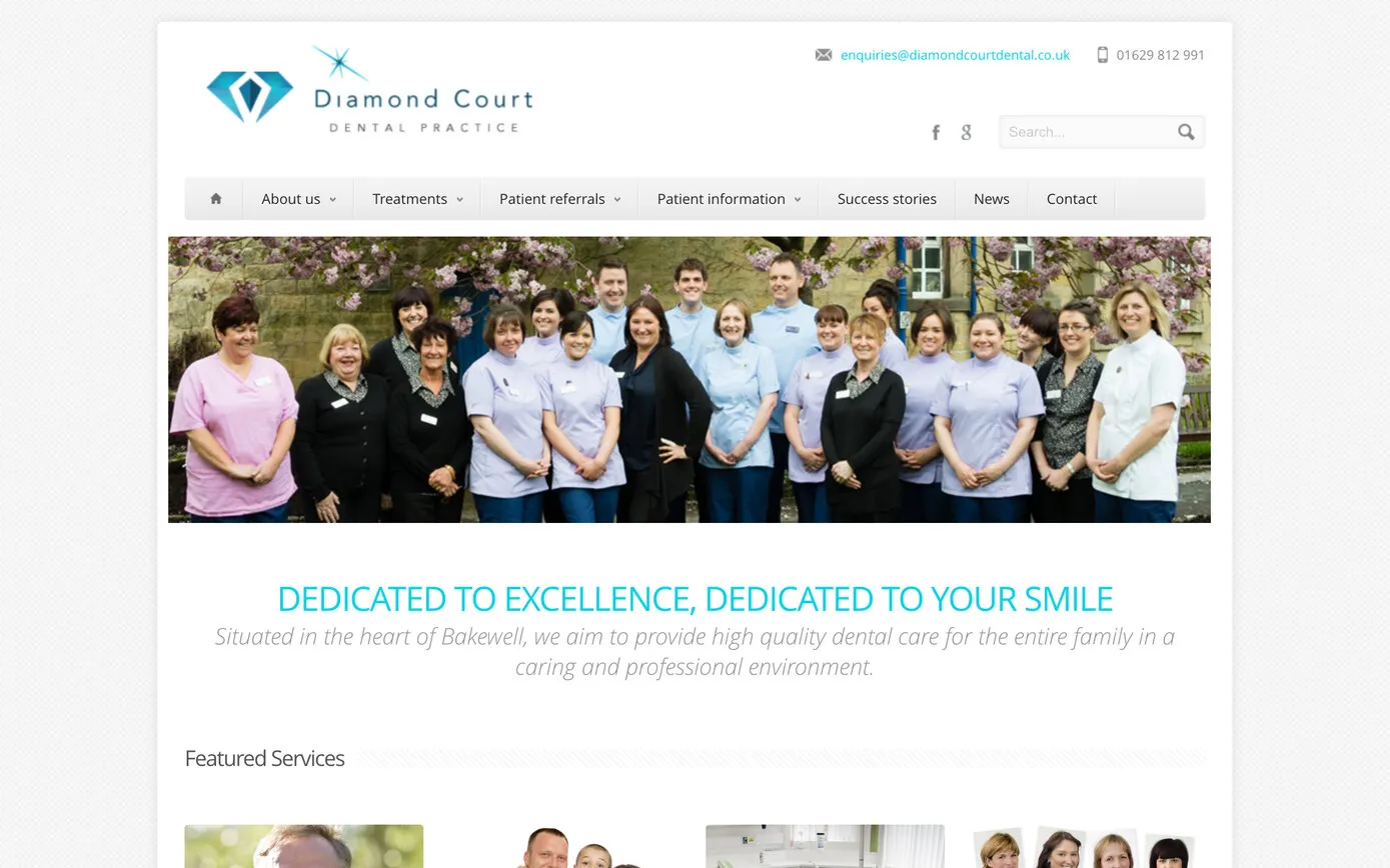
In 2013 we rebuilt it on WordPress so the practice could add its own news, refreshed the logo, photographed the team and added the two secure forms. Paul Flint chose the tagline himself, “Dedicated to excellence, dedicated to your smile”, and wrote to us the week before it went live:
We’re all really pleased with the website – it looks brilliant!
We’ve looked after it ever since: hosting, updates, new pages, stationery and team photos. In early 2026, with the reception freshly renovated, the practice asked us to “push forwards with the professional photos and website plans”, and in March we took the plan to Jamie Denholm, Paul Flint and Pamela Drabble at the practice.
“Bakewell Dentist”, with the practice’s treatments in three columns and a Flash animation on the home page.
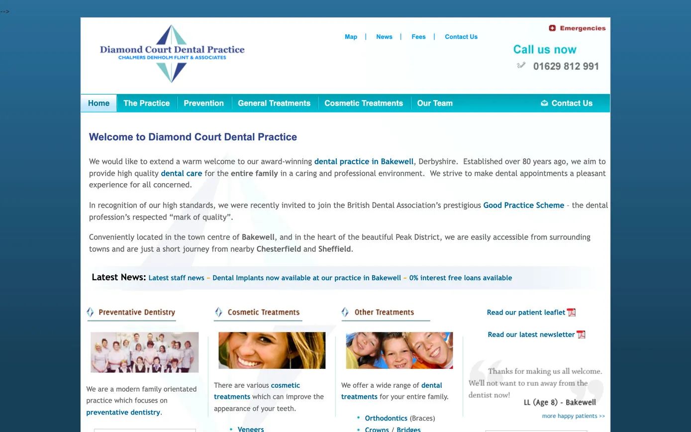
News the practice could add itself, team photos, the secure referral form and the free e-consultation.
Built for the phone, blisteringly fast, with our own reviews system and enquiry tracking.
2008 and 2013 from the Internet Archive’s Wayback Machine, captured in 2009 and 2014.
The new website went live on 16 October 2026. Google’s PageSpeed test gives it 98 for performance on a phone and 100 on a computer. The practice’s Google reviews appear in four designs from our own reviews system, every enquiry from the contact form says where it came from, and referrals and e-consultations stay behind a secure login, as they have since 2013.
Nineteen years after our first meeting, the practice has a website that looks the way it treats: unhurried, transparent and quietly excellent.
Designed and written by us from the practice’s own brief, with every treatment page checked by its clinicians.