premier-mt.uk

Today’s site
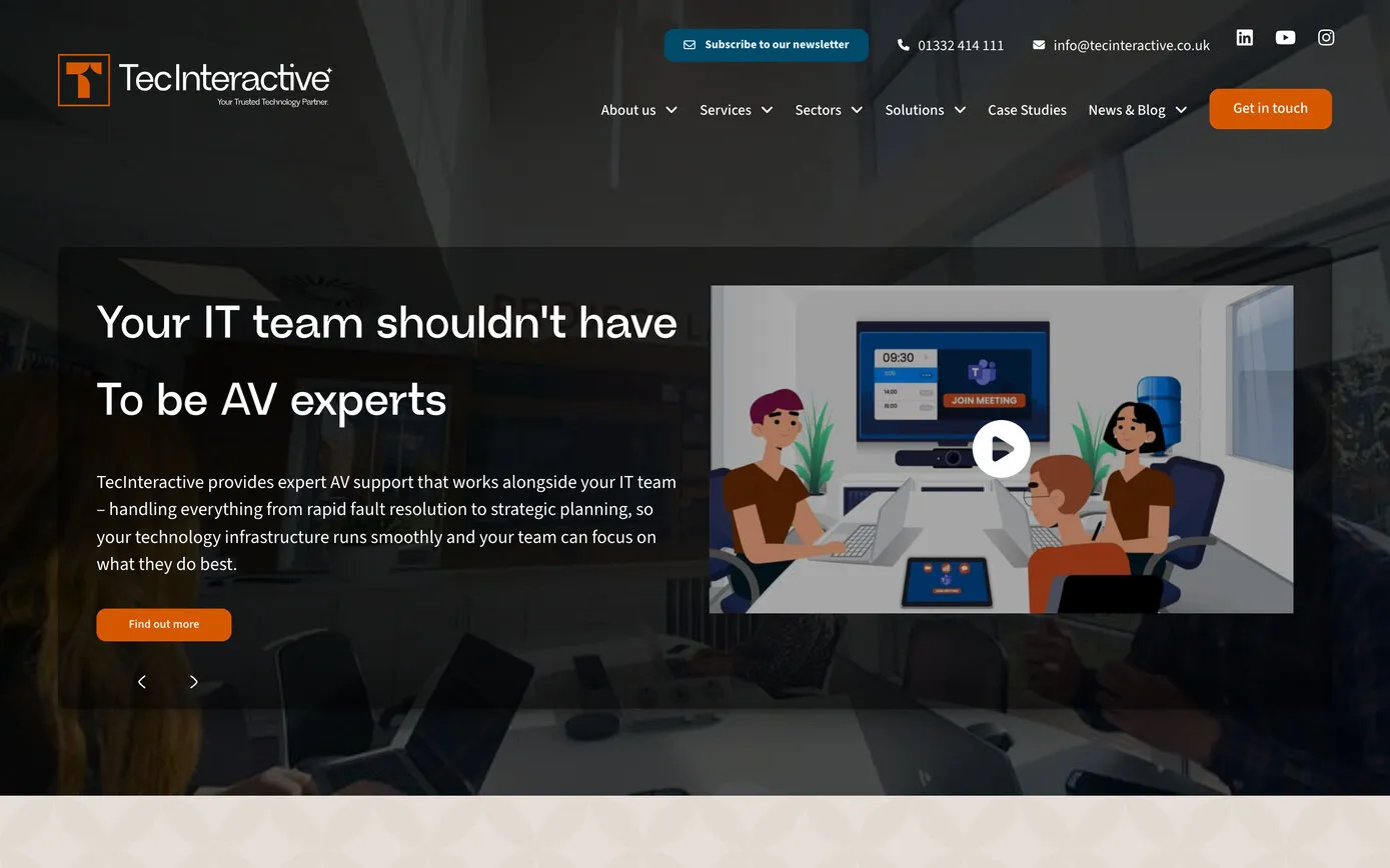
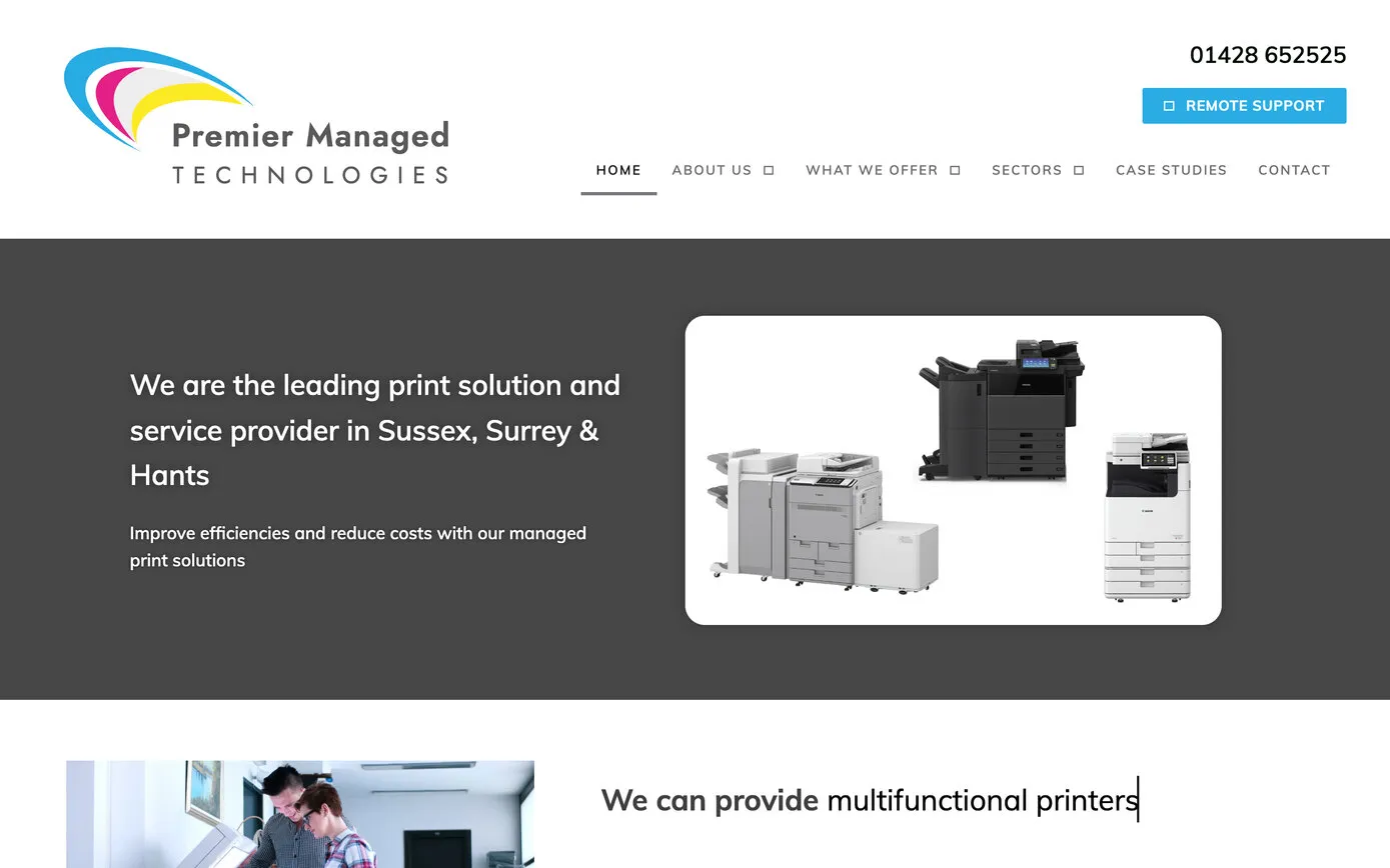
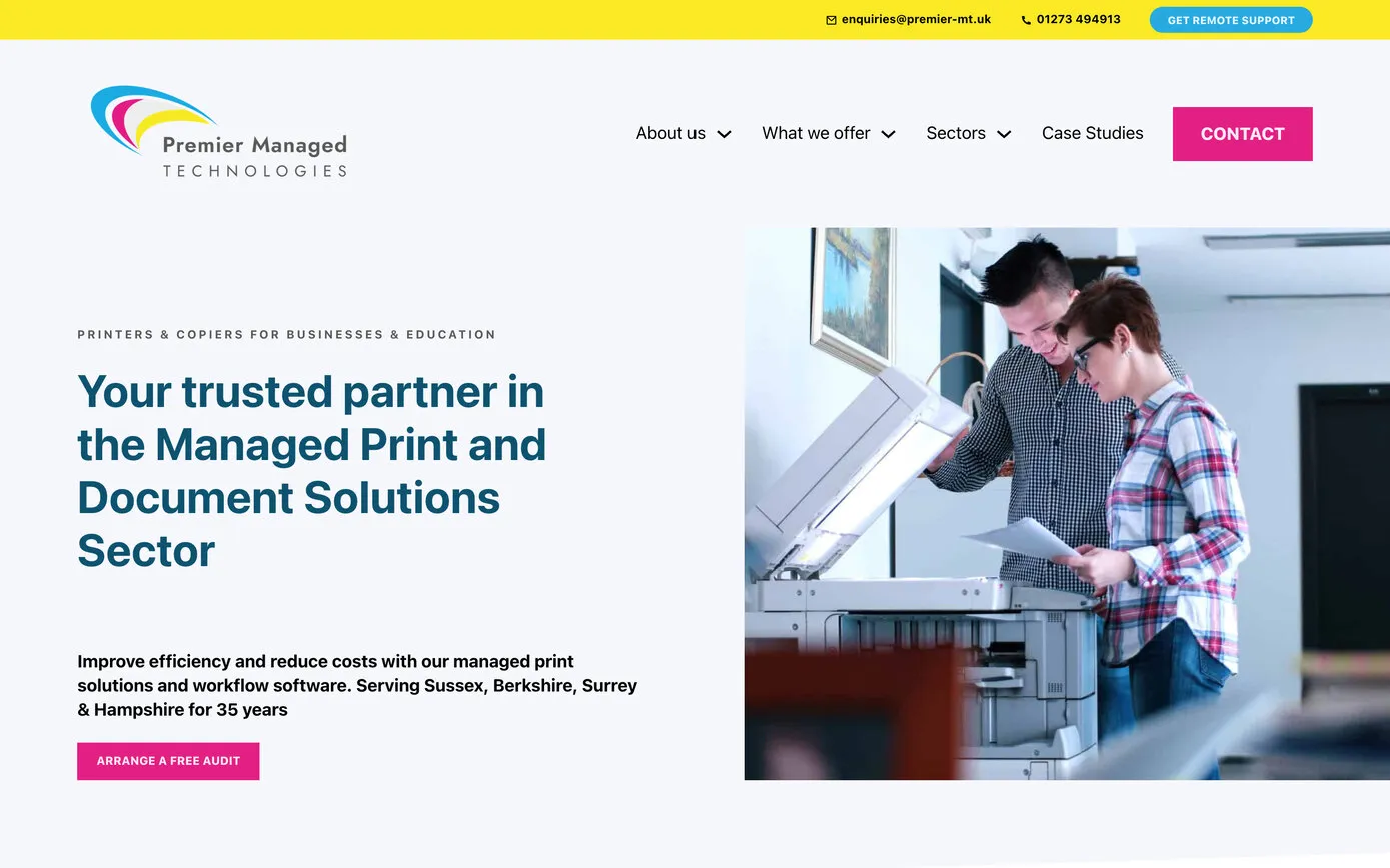
Our 2025 rebuild, with the logo’s cyan, magenta and yellow all the way through.
- Website
- Logo
Premier Managed Technologies supplies, installs and looks after printers and copiers for businesses and education across Sussex, Surrey, Hampshire and Berkshire, from Henfield in West Sussex. Until 2021 it was UK Office Systems, a Haslemere company founded in 1990. We started on UK Office Systems’ new website in 2019, saw it through the change of name, designed the new logo, moved the site to its new address and rebuilt it in 2025, and we’ve looked after it all along.
UK Office Systems was founded in 1990 and spent the next thirty years selling and looking after copiers, printers and scanners for offices and schools from Haslemere in Surrey, with Ricoh for many years and later with Toshiba too. In 2018 it joined the same group as Premier Office, a long-established print business at Henfield Business Park in West Sussex, with a plan to bring the two together.
In January 2019 the copywriter Danielle Gaglione, who also wrote for TecInteractive, sent us UK Office Systems’ brief for a new website. We met the team on a Skype call in February and started in March.
Our first job, before changing anything, was to take a complete copy of the old site and a list of every address on it. It’s a habit worth keeping: a list of the old addresses is exactly what you need when a site moves, as this one did two years later.
The old site was a catalogue of manufacturers’ machines and brochures. Our plan that May turned it round to face the people who buy print services rather than the people trying to fix their own printers: the problems the company solves, its three steps from enquiry to installation, and the people who do the work, close by.
Highlight the ‘local’ aspect – clients are not dealing with a faceless corporation such as Ricoh / Brother directly.
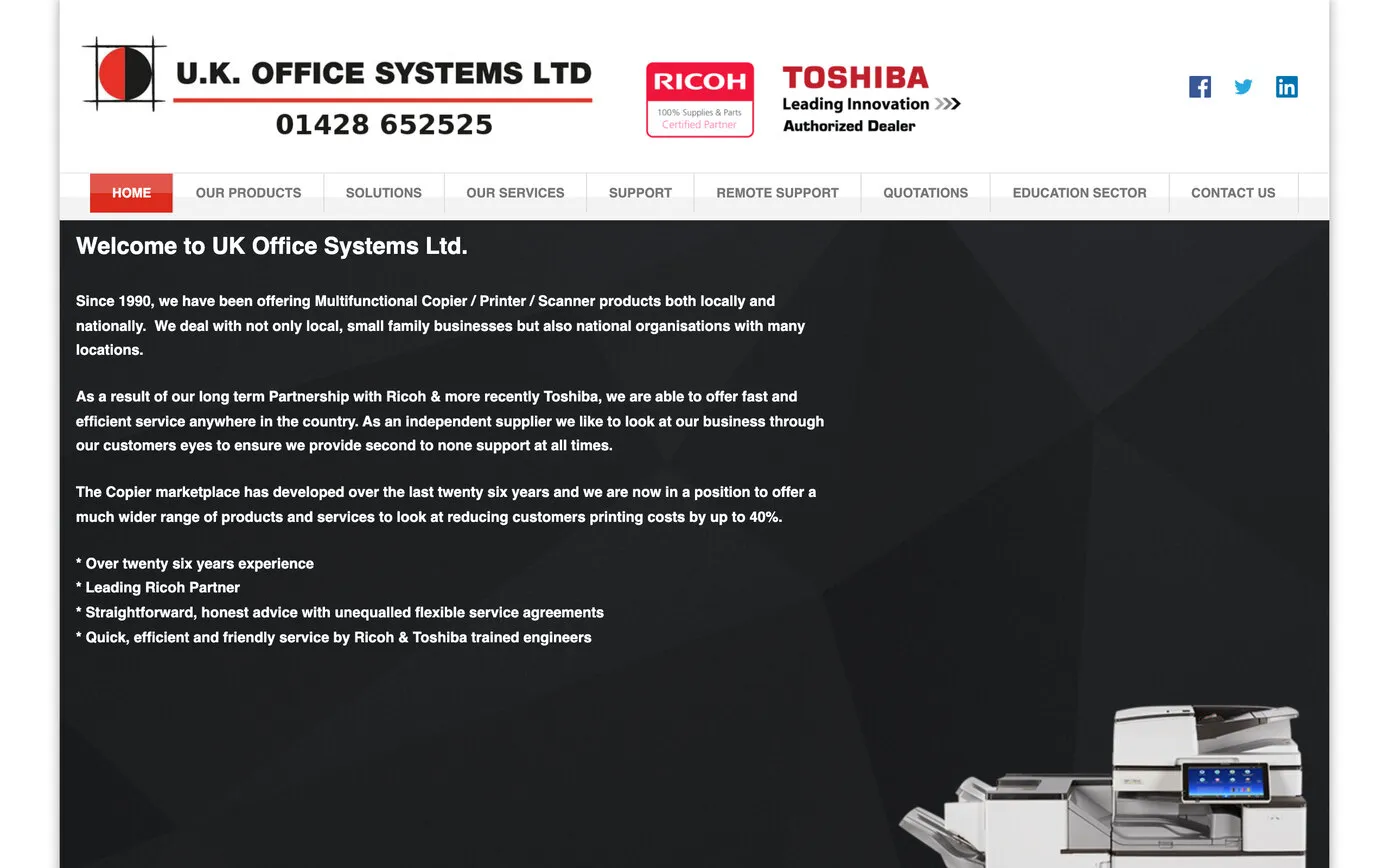
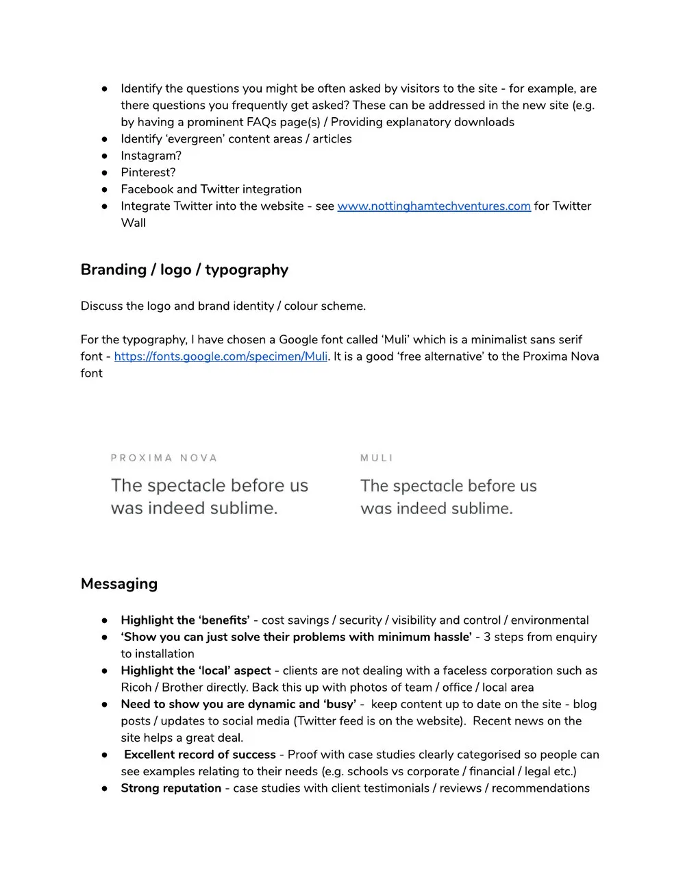
Two of the twenty pages in our plan for the new site, May 2019.
Through 2019 we built the new site in WordPress, with Danielle’s words on every page and the company’s three steps at the heart of it: Recommend, Install and Support. Those three steps are still on the home page today.
Choosing a copier shouldn’t start with a long form, so we built Help me choose: a short run of questions, one at a time and full screen, some with picture answers. Are you in education or business? Are you looking to buy or lease? How many reams of paper do you use each month? The questions change with the answers, so a school isn’t asked how many people work in its office.
Rather than a long form, it asks a series of questions with a nice user experience.
The catalogue was simplified the same way. Instead of the same machine listed again and again under different model numbers, each family became one product with its models in a table, where search engines could still find them; older machines moved to a discontinued section that points to the newer ones; and each product got a few lines in plain English on why you might choose it.
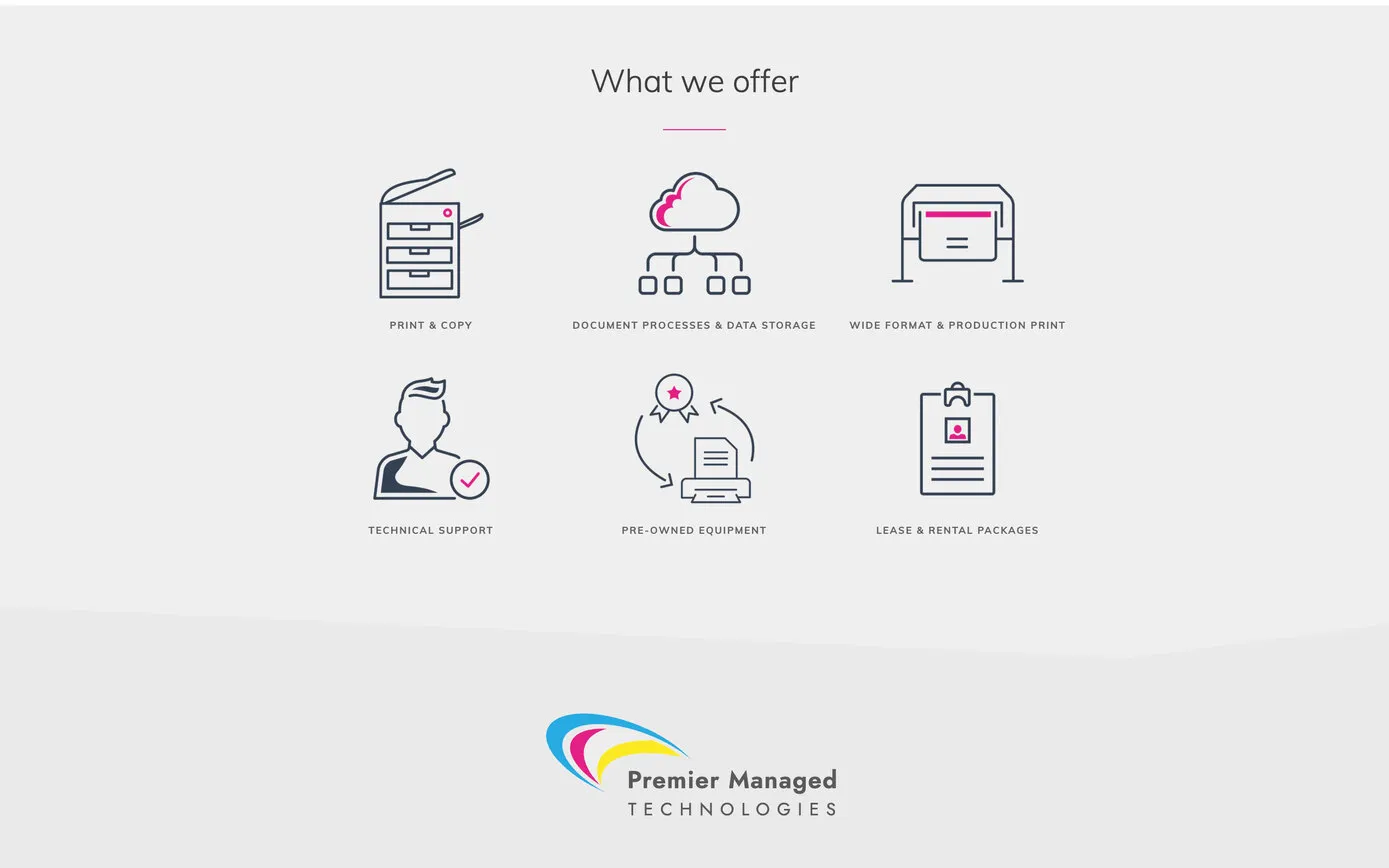
The team wanted drawings rather than the product photos competitors used, so we drew a set of line icons for the services, from a copier and a plotter to an engineer with a tick, in navy with UK Office Systems’ red. By January 2020 the site was ready to go. Then the plan to bring the two businesses together moved up a gear, and the site waited, kept up to date, for the new company.
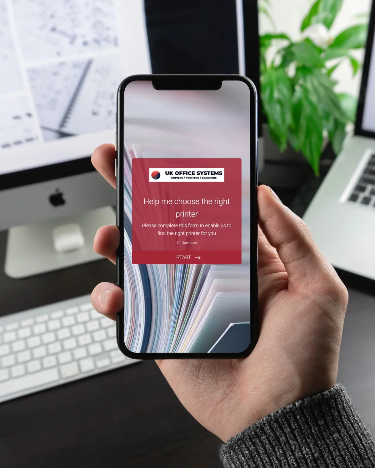
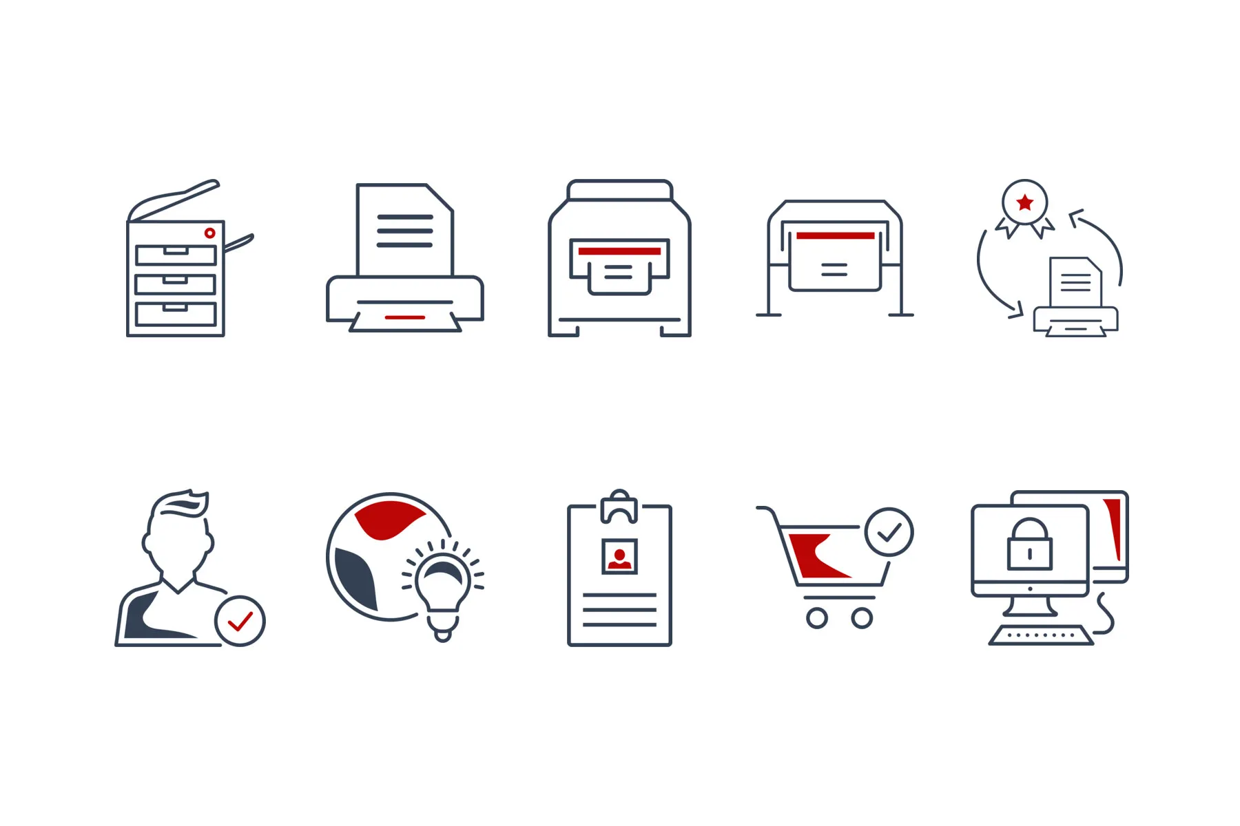
Help me choose on a phone, and the line drawings, both in UK Office Systems’ red, 2019.
In September 2020, after a call about renaming the business, we sent over a few thoughts. The company looked after schools as well as offices, so “Office” could confuse; “Systems” was a dated word for technology; and a name tied to printers or copiers would hold the business back if it moved further into software and consultancy.
The name should allow you to develop into other areas in the future.
“Premier”, from the Henfield business, would stay. The words around it changed:

On a Friday in July 2021, with the new company a month away, the team asked whether we could help with a logo. They had a direction they liked. We suggested redrawing it as an original mark the company would own outright, in flat colour with no gradients, so it would still work in one or two colours, and with a cleaner typeface for the name, one that wouldn’t fight with the website.
Five days later we sent a sheet of variations: round marks and sweeping ones, the name in capitals and in lower case, stacked and side by side, and one in black. The name is long, so we split it over two lines, with TECHNOLOGIES in a lighter weight, spaced out across the width. Our note picked a favourite:
This whitespace works quite well ‘merging’ into the words for the logo – if I was to pick a favourite, it would probably be this one.
The reply came back that evening: “That was quick!” The team chose the same one the next morning, the final files followed on the Monday, and within days the logo was on the company’s new customer portal, ready for day one.
Three arcs in cyan, magenta and yellow sweep up to the right around a pale grey sheet. They’re the colours a colour printer prints with, which suits a company that sells and services printers and copiers. The name is set in Jost, a free Google font: “Premier Managed” in SemiBold and TECHNOLOGIES in Regular.

Round, on three lines
In lower case

Stacked

In one colour

Cut out to white

The one that stuck
From the concepts sheet we sent on 7 July 2021.
The logo as a printer’s proof: three arcs in cyan, magenta and yellow around a pale grey sheet, and the name in Jost, “Premier Managed” in SemiBold over TECHNOLOGIES in Regular, spaced wide.
The same colours have run through everything since: the 2021 website, the pitch-side boards and the 2025 rebuild, with a deep navy for the darker parts of the site.
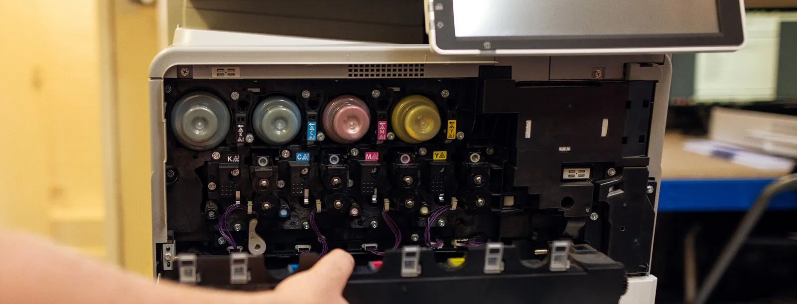
The same colours inside a colour copier: K, C, M and Y. UK Office Systems’ own photo, 2019.
The new company opened on Monday 2 August 2021. On the Friday before, the team realised there was nothing yet to greet visitors at the new address, so we set up a landing page with the logo, the address, the phone number and a note that the new site was coming soon. It was live at premier-mt.uk that afternoon.
The waiting 2019 site became the new company’s. The team wanted it stripped back and simple: the new cyan, a menu that stays at the top as you scroll, much less scrolling, and a plain way to get in touch in place of Help me choose. Greg Payne, a director, took the project on in August and wrote the new What we offer text, and we re-inked the line drawings in the logo’s magenta. Greg’s reply when it was finished: “Perfect thanks – all looks good to me so go ahead.” The site went live on Monday 20 September 2021, with Google Analytics set up in the company’s own account, so the figures belong to the company.
Then the move itself. Over the years, UK Office Systems’ pages had gathered signposts: links from other websites, bookmarks, old emails, and Google’s own memory of where everything was. Switch the old site off and every one of those signposts leads nowhere, and the new name starts from scratch in search results. So instead of switching it off, we gave each of the old site’s 91 addresses a forwarding address: a permanent redirect, which sends people and search engines straight on to the nearest new page, and tells Google that the page has moved for good, so the standing it had built up moves with it.
I would really recommend that we don’t just switch the old site off but set up proper redirects so any Google authority from the old site can pass to the new site.
The team checked the list before it went live, and the old site stayed up until the moment it switched over, so nothing went dark in between. First, the old web addresses came into the company’s own hands:
Fantastic, I’ve just heard that the domains have been released
The business listings got the same care. A Google listing is the panel with the map, the phone number and the reviews that appears when someone searches for a company, and an established one carries years of history. So rather than start new listings, we renamed the existing ones on Google and Bing, and the new name kept the old one’s history and reviews. We told Google’s Search Console about the change of address, and the LinkedIn page was renamed too, with square versions of the logo for profile pictures.
Seven of the old site’s 91 addresses, and where all 91 went: the number beside each new page is how many old addresses led to it.
Since the launch we’ve looked after the site every month, its hosting, updates and Google listing, and taken on the jobs that come up in between.
In 2022 the company began writing up its own case studies. Rather than post them as PDFs, we turned each one into a page of its own, which search engines read more readily, which can appear beside the services it relates to, and which the team can share on LinkedIn.
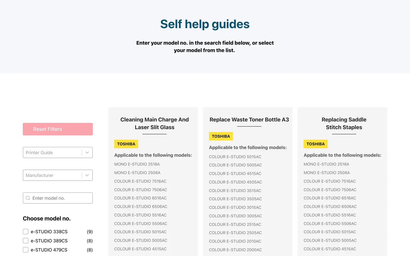
In 2023 the operations manager suggested putting Toshiba’s self-help guides on the site: how to change a toner, load the paper trays or replace the staples. The guides were PDFs with QR codes for the videos, which works on paper, but as we pointed out, “you would not be able to scan your own phone’s screen”. So we built a library instead: each guide with its video and the models it fits, so you pick your model and see the guides for it. The team can add new guides themselves.
Later that year Greg asked about the company’s sales and service agreement, which customers were printing, signing and scanning back. We restyled it as a branded Word template the team fills in for each customer, and set up an online signing service: the customer gets a link, signs on screen, and everyone receives the signed copy. Greg tried it the next day:
Thanks for this – I’ve signed the test document and it all looks straight forward.
Within a month, customers were signing their agreements online.
In September 2024, as Premier became an Official Partner of Steyning Town Community FC, Greg asked for artwork for the pitch-side boards: 2440 by 800 mm. A board that long and thin doesn’t suit the logo as it stands, because the name would come out small. So we cropped the arcs into the corner and let the name fill the board, with the four services along the bottom in magenta and the web address in cyan. As our note put it, “it still gives us the colourful effect of the logo but the name ‘Premier Managed Technologies’ is much bigger”. Greg agreed: “This is good thanks – I agree that the cropped version will be better for this.”
| Job | When | Status |
|---|---|---|
| A landing page for the new company, the day it was asked for | Jul 2021 | Done |
| The new website, live at premier-mt.uk | Sep 2021 | Done |
| 91 old addresses redirected, Google and Bing listings renamed | Oct–Nov 2021 | Done |
| Case studies, each a page of its own | Jun 2022 | Done |
| A self-help guide library, by model number | May 2023 | Done |
| The sales and service agreement, signed online | Oct 2023 | Done |
| The Henfield phone number, on the site and on Google | Nov 2023 | Done |
| Pitch-side boards for Steyning Town Community FC | Sep 2024 | Done |
| A page for the free toner recycling scheme, the day the words arrived | Jan 2025 | Done |
| The new website, rebuilt in Bricks and Automatic.css | May 2025 | Done |
| A remote support page for the new support tool | Jan 2026 | Done |
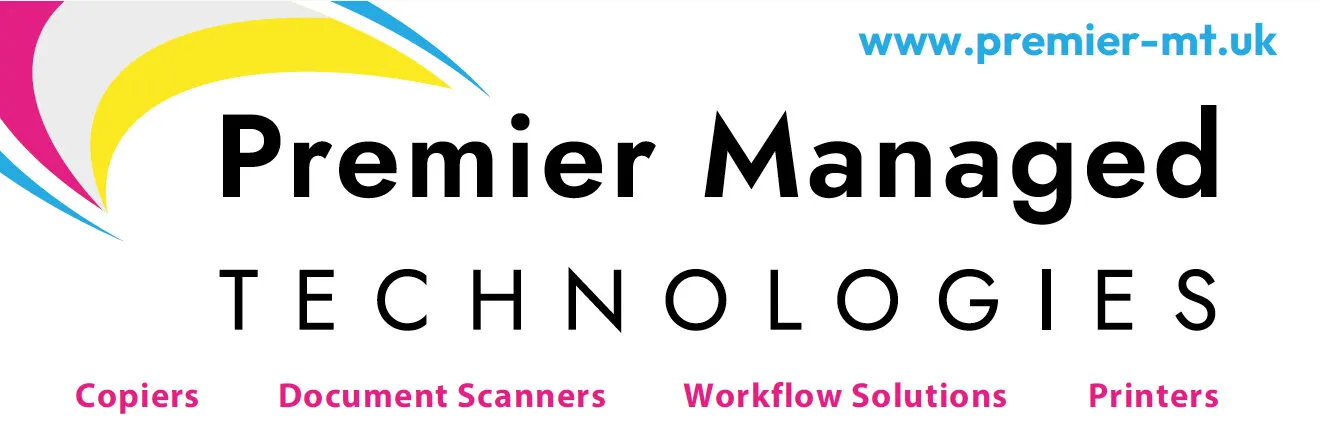
The pitch-side board, 2440 by 800 mm, September 2024: the arcs cropped into the corner so the name can be big.
In the autumn of 2024 Greg suggested it was time to look at the website again. We met in January 2025 and made the quick changes straight away: a page for the company’s free toner recycling scheme went up the day Greg sent the words, and a proper page for remote support the next morning, because people are rightly wary of downloading software from a bare link.
For the rest we proposed a rebuild in Bricks with Automatic.css, the way we build sites now: spacing, type and colour stay consistent on every page, the code is leaner, so pages load faster, and accessibility is built in. As our proposal put it, “Sometimes less is more.”
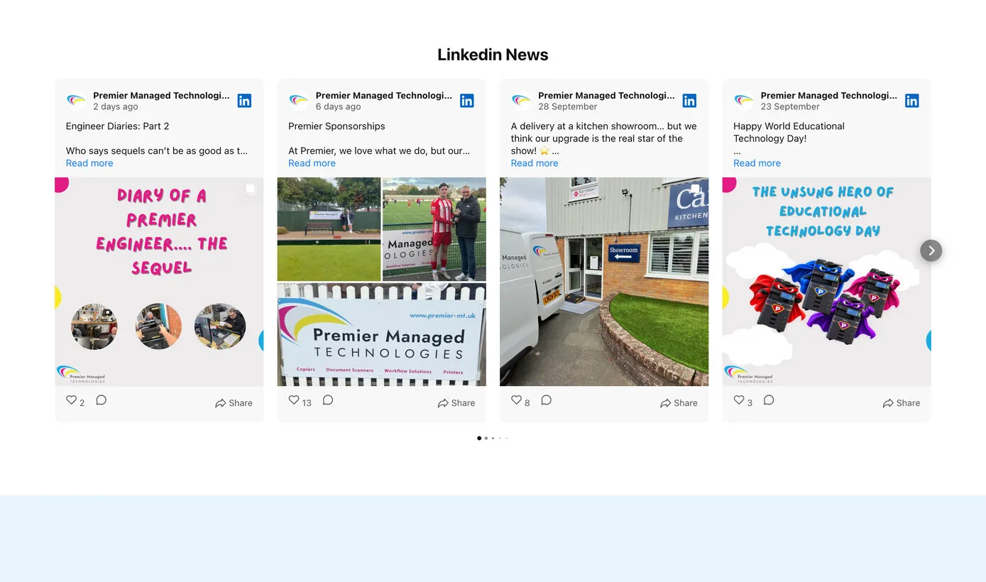
Greg’s brief was a fresher look, case studies the team can add themselves, and the company’s LinkedIn posts on the site. The new site uses all of the logo’s colours: a yellow bar along the top with the phone number and a cyan button for remote support, magenta for every Arrange a free audit, and the deep navy behind the contact form. It has the eight services, the three steps from 2019, case studies from a simple form, the self-help guides, a refer-a-friend form, and the latest LinkedIn posts above the footer. It went live on Tuesday 13 May 2025.
Thanks for your hard work on the new site – I think it looks really fresh & much cleaner.
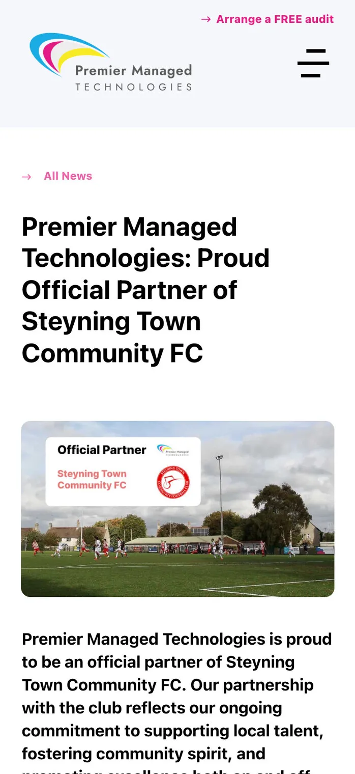
Soon after, we added a news post about the Steyning Town partnership, with the club’s Official Partner badge in the footer beside the company’s Toshiba and Canon partner badges.
In January 2026 the company changed its remote-support tool, and Steve Hayward, who looks after IT, asked for an easy guide for customers. We drafted the page that morning: what to expect, five simple steps, why it’s secure and what can be fixed remotely, all behind one support button rather than two, because we like to keep a site’s navigation as simple as possible.
Absolutely perfect as usual you’ve understood the concept straight away; the text is brilliant.
UK Office Systems became Premier Managed Technologies without starting again. The website built for the old name became the new company’s, every old address was sent on to the right new page, and the Google and Bing listings kept their history under the new name. Since then the site has grown with the business, from case studies and self-help guides to online signing, and in 2025 a fresh rebuild that the team keeps up to date itself.
The achievements are Premier’s own: 35 years in business, Toshiba Diamond Business Partner and Canon Silver Partner status, and an Official Partner of Steyning Town Community FC since the 2024–25 season, renewed for 2026–27. As one of its school customers puts it on Premier’s website: “On occasions their engineers are onsite before we have even called them!”
Case studies, self-help guides and news are simple forms in WordPress, so the team adds them between our visits. We look after the hosting, updates, backups and the Google listing every month.